
ADA website design steps
Nine steps for ADA-compliant website design: contrast, readable type, no color-only cues, accessible navigation and forms, mobile, motion, and annotated handoffs.
Nine steps for ADA-compliant website design: contrast, readable type, no color-only cues, accessible navigation and forms, mobile, motion, and annotated handoffs.
A website that is accessible to individuals with disabilities begins with the right elements outlined by the web designer. The designer’s expertise can guide the development of the website to include features such as high-contrast colors, legible typefaces, and the accessible navigation and functionality needed to align with WCAG standards.
The following nine steps can guide website designers through the process of thinking through creating accessible websites:
Step | Action | What to do |
|---|---|---|
Establish accessibility requirements | Add WCAG 2.2 AA considerations to design briefs and design-system specifications. | |
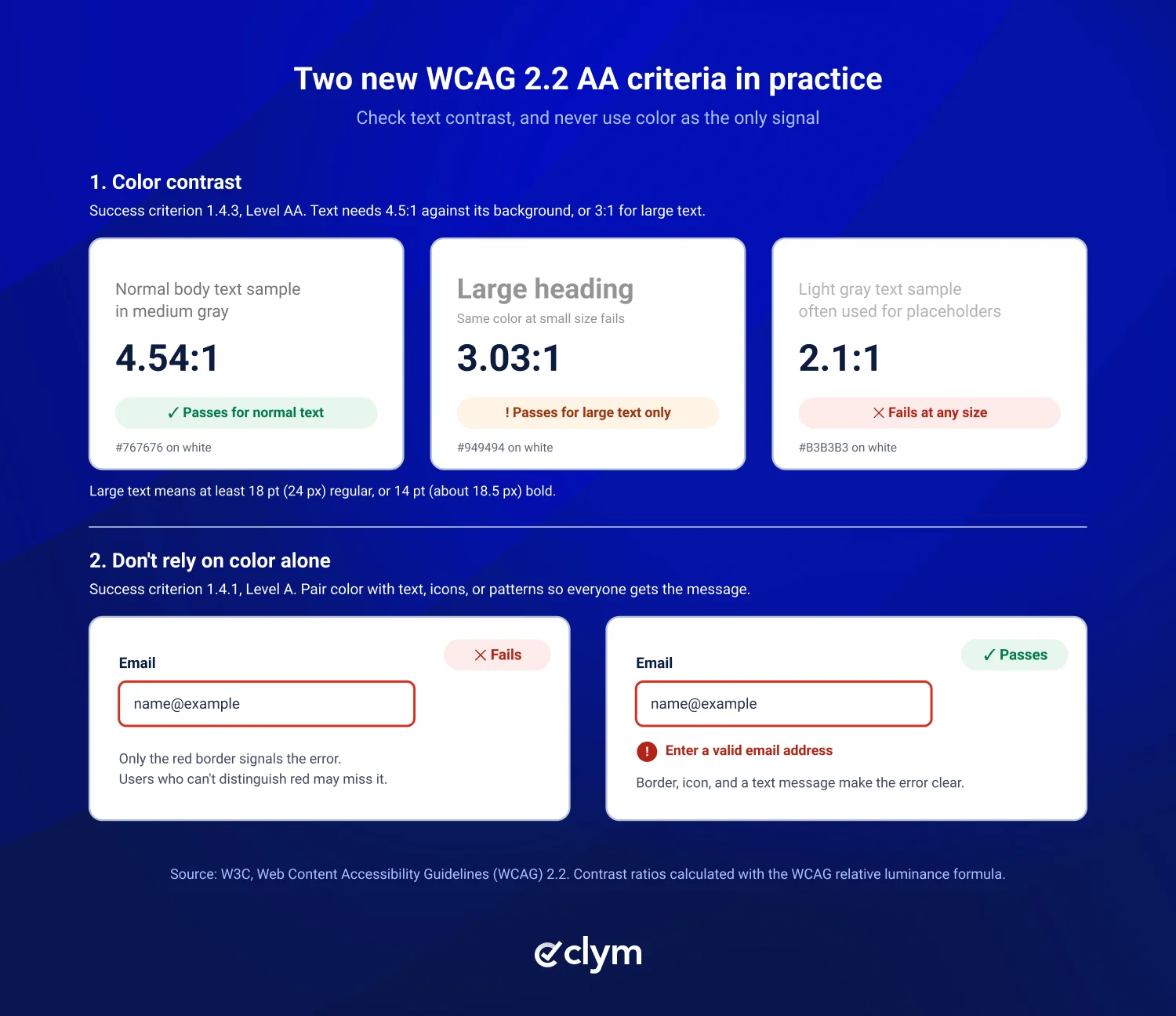
Check color contrast | Aim for at least 4.5:1 for normal text and 3:1 for large text, with applicable exceptions. Buttons, form field borders, icons, and focus indicators need 3:1 against adjacent colors (1.4.11 Non-text Contrast, AA). | |
Design readable typography | Use legible typefaces and layouts that accommodate text resizing and spacing adjustments without losing functionality. Learn about ADA-compliant fonts. | |
Avoid color-only indicators | Combine color with labels, icons, patterns, or other visual cues to communicate errors and statuses. | |
Create accessible navigation | Design consistent navigation, clear menus, visible keyboard focus, and predictable interactions. | |
Design accessible forms | Include visible labels, clear instructions, understandable errors, and appropriately sized interactive controls. | |
Account for mobile accessibility | Support zoom, reflow, orientation flexibility, and touch targets. WCAG 2.2 AA generally requires a 24-by-24 CSS-pixel target or an applicable exception. | |
Plan for motion and interaction | Avoid unnecessary flashing, support reduced motion, and ensure users can pause applicable moving content; as good practice, support reduced motion. | |
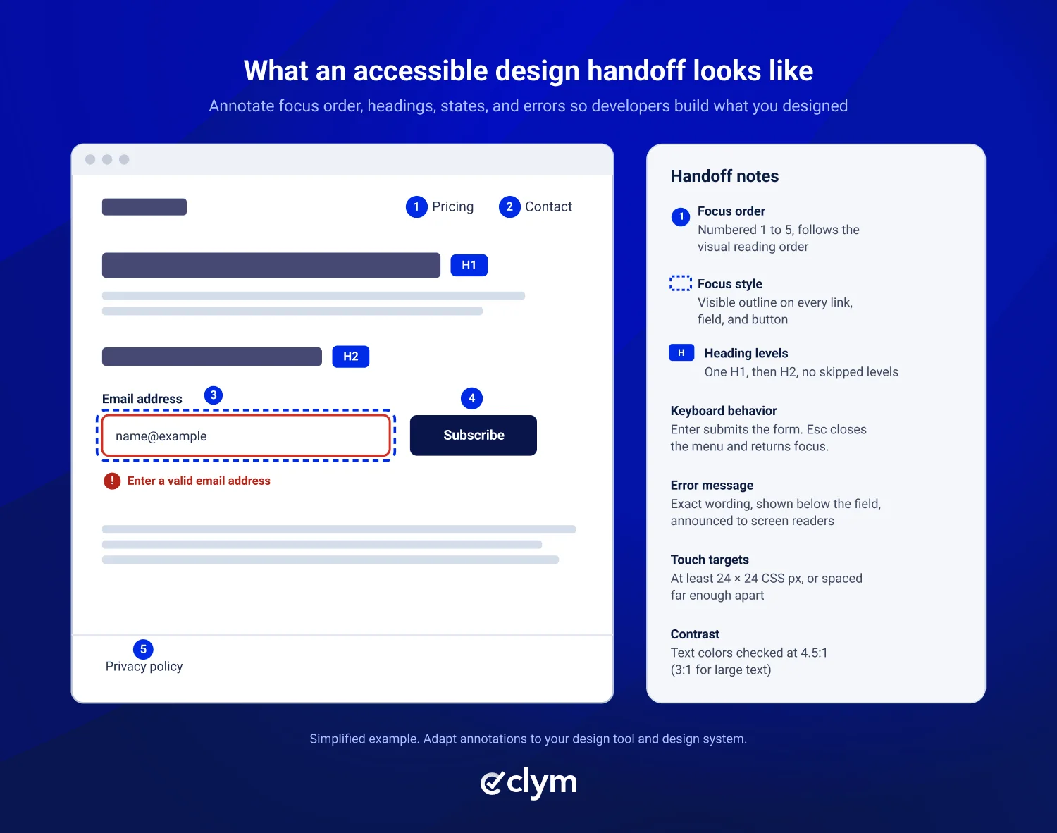
Annotate design handoffs | Document heading hierarchy, focus states, expected keyboard behavior, error messages, and interaction patterns for developers. |
Designer guidance provides the foundational elements used to build an ADA accessible website. Their selections cover color contrast, readable typography, and accessible navigation, forms, and formats. Design is only one part of what makes a website ADA accessible.
To check your whole website for common accessibility issues, including code and content, start with our free Accessibility Scanner.
ADA-compliant website design means making design choices, such as color contrast, readable typography, clear navigation, accessible forms, and visible focus states, that let people with disabilities use a website. The ADA doesn't set its own design specifications, so teams usually design to the Web Content Accessibility Guidelines (WCAG). Use WCAG 2.2 Level AA as a practical current benchmark unless a requirement that applies to your organization names a different version or standard.
WCAG 2.2 Level AA requires a contrast ratio of at least 4.5:1 for normal text and 3:1 for large text (at least 18-point regular or 14-point bold). Essential visual elements, including icons, form field boundaries, and custom focus indicators, generally need at least 3:1 contrast against adjacent colors, with some exceptions.
No. Neither the ADA nor WCAG requires specific fonts. The focus is on readability, including clear typography, sufficient contrast, and text that remains usable when resized to 200%. Sans serif fonts are commonly used, but accessibility depends on how the text is presented, not just the typeface.
WCAG 2.2 Level AA requires clickable targets to be at least 24 by 24 CSS pixels, unless an exception applies, such as enough spacing around a smaller target. The stricter Level AAA criterion requires 44 by 44 CSS pixels, which many design systems use as the default for touch screens.
Yes, partly. Designers can check color contrast, plan focus order, and annotate headings, states, and error messages in their design files. Some issues only show up once the site is built, such as keyboard behavior and screen reader output, so the live site still needs automated scanning and manual testing.

Compliance Content Manager | CIPP/E (IAPP) | CPACC (IAAP)
Alex is a Compliance Content Manager at Clym, where he researches and writes about everything related to data privacy and web accessibility compliance for businesses, helping them stay informed on their compliance needs and spreading awareness about making the web safer and more inclusive. When he's not writing about compliance, Alex has his nose in a book or is hiking in the great outdoors.